website design: looking for More?

Blog, Web

Design by Indi Hanlee

Are you looking for more? Not satisfied with always trying to get more? More stuff, more sex, more friendship, more significance? Hunger for more justice, more hope about the end of the world, more free food? More is about the good news that Jesus offers more to life, more life eternally and more to life now!

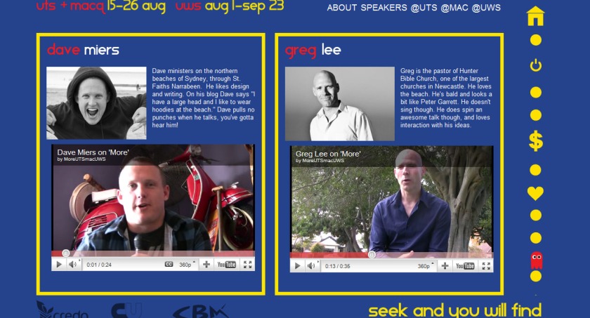
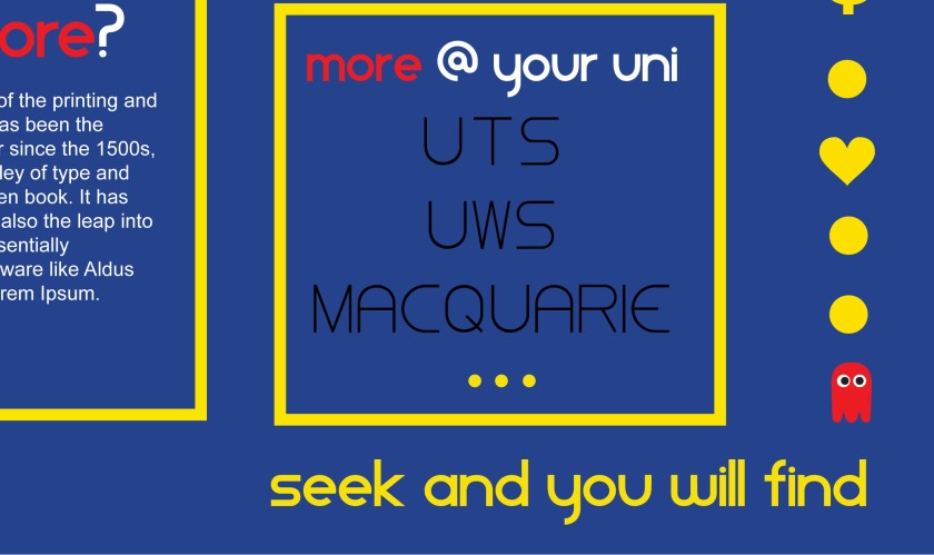
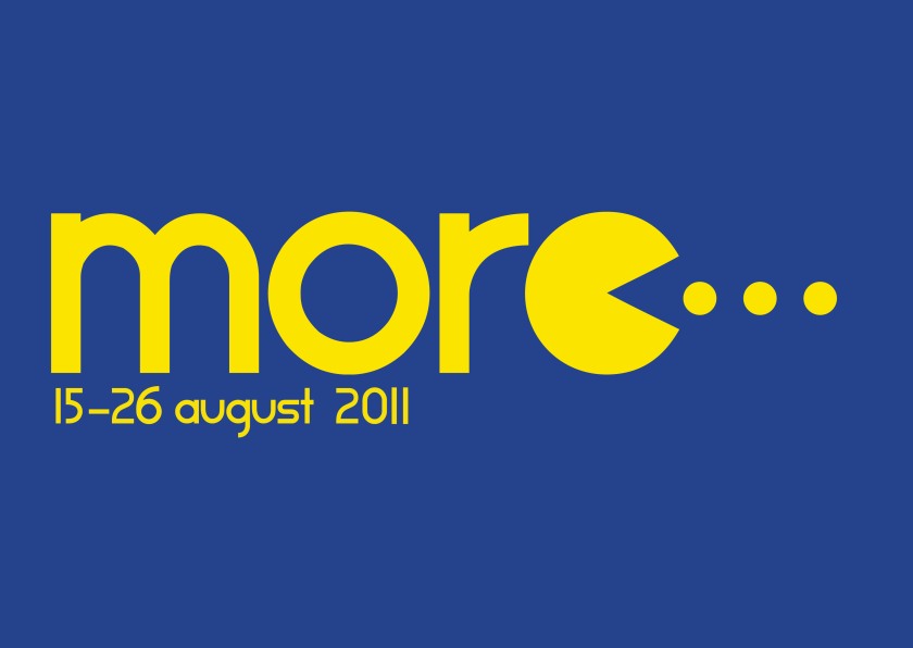
Credo‘s biennnial mission//outreach event extravaganza is this year being organised and run across 3 university campuses, which is really exciting! Christian Union at Macquarie uni and Campus Bible Ministries at UWS are running More alongside us, sharing speakers and branding (concept and images by Indigo Hanlee), and also, a website.

James Kirsop and I designed and delivered the website, which needed to promote each campus’s events equally but clearly, so that people weren’t confused by what was happening at their uni.

It incorporates icons to represent the nature of each event and videos (edited by James Kirsop) on the speakers and the topics of the talks. Dave Miers and Greg Lee will be speaking at all three campuses on a range of topics. Both of them have excellent video manners!

Technical notes: I was a little disappointed with HTML5 video – I had very high hopes about its beauty and compatibility. In the end we went with YouTube videos and embedding, which seems to be very compatible, except for those with internet blocking software…

Check out the website, come along to one of the events, appreciate the pacman stylings of Indigo Hanlee who expertly came up with the initial concept of the design. She also helped out with making sure the website fit the branding of the other events.
website design: Pace Farm Eggs

Blog, Web

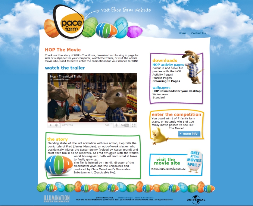
Pace Farm website header

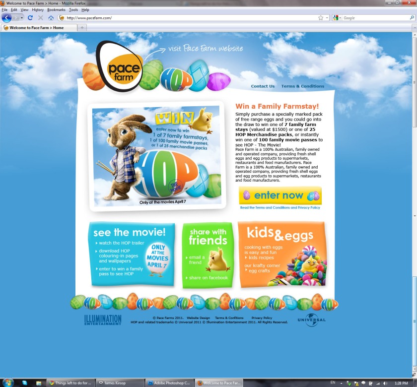
What kept us busy over the summer, you might be wondering? Well, it wasn’t all days at the beach and summer road trips – instead James Kirsop and I were working on a promotional website for Pace Farm Eggs, an Australian family-owned egg company.

They ran a competition from February to April 2011 as a cross-promotion with Universal Studios, Illumination Entertainment and their Easter family movie release, ‘HOP‘, and they wanted an engaging new homepage to complement their online competition entry form.

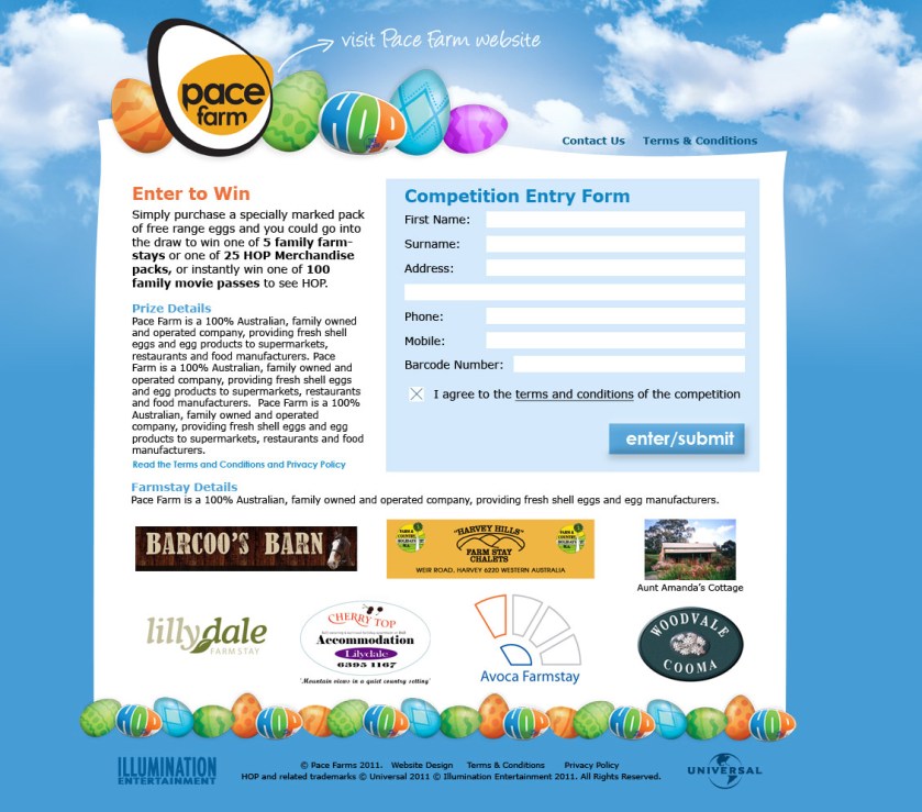
The promotion was entered by purchasing a pack of specially marked eggs, and then entering online through a secure entry form, which randomly generated 100 instant winners of family movie passes, and stored the entrant’s details for the major prize draw – 7 family farmstays!

Entry Form Page

It was considerably successful – there were more than 6,000 visits to the website over the competition period and more than 3,000 people entered the competition – surpassing our client’s expectations for the website.

We also included content from Universal – a plot synopsis for the movie, colouring-in pages, link to the official HOP movie website, a trailer and more, to tie into the promotion. Aren’t the characters from the movie cute! The home page also had links to existing Pace Farm website content like kid-friendly recipes and craft ideas, and a header link let visitors go straight to the old homepage if they so desired.

Overall, a success! Happy clients, and a technically complex website put together by James Kirsop, myself and Gareth Parker (ASP.Net coding). We were overwhelmed by the responses and so excited to see that the competition was so successful. To check if you’re a winner, visit the Pace Farm Eggs homepage today and have a look at our work in action.

promotional flyers for family events: Springwood/Woodford Church

Blog, Print

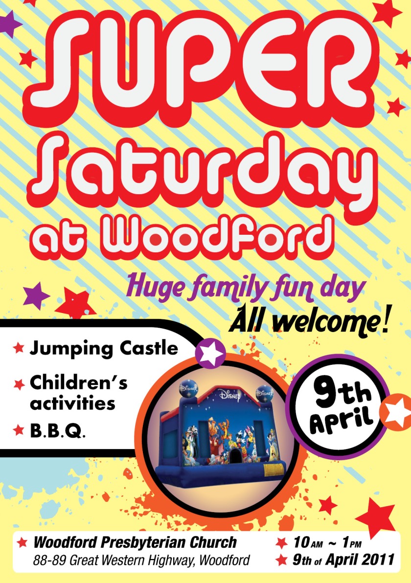
Flyer for Family Fun Day at Woodford Church

An A5 flyer to go out to school children in special Scripture assemblies in the local area, and an A4 version as a poster for similar. I worked from a basic design given to improve the typographic hierarchy and make key information (date, location) more visible. The colours are brighter and more visually appealing, using contrasting colours to attract attention.

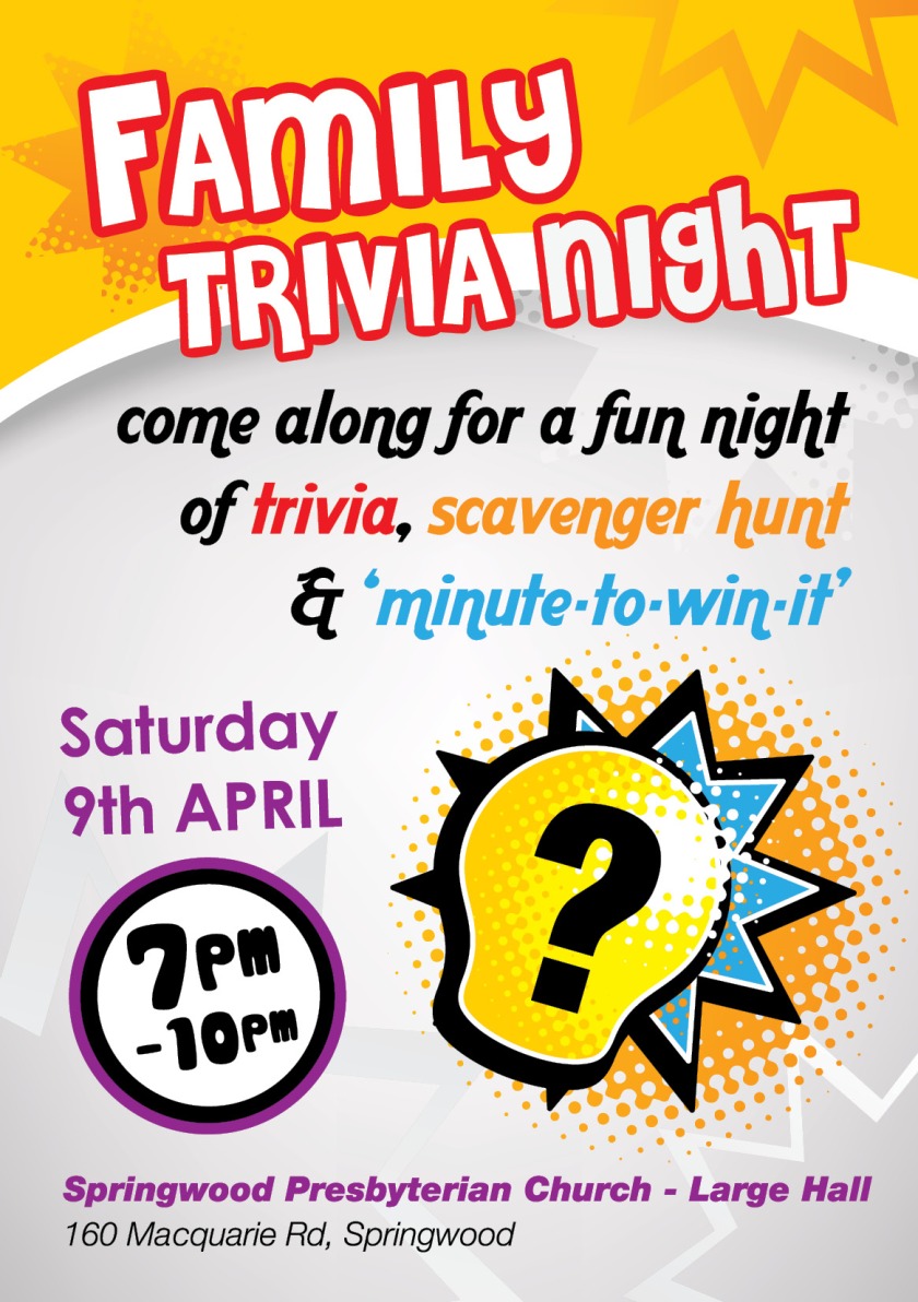
Flyer for Family Trivia Night

Similar format issues – for a flyer (probably the reverse side of the first flyer, I added colour, interest and highlighted important information, such as the time (important for families considering coming – knowing the time is essential). Using the Aardvark font to add interest with readability still a priority. I’m quite satisfied with the typographic outcomes of both, considering the short turnaround (ready for pre-press/print in less than 24 hours).

blog: gumnut’s growing…

Blog

I’m currently working on a new website design for Gumnut Kindergarten, which is why I haven’t been updating much.
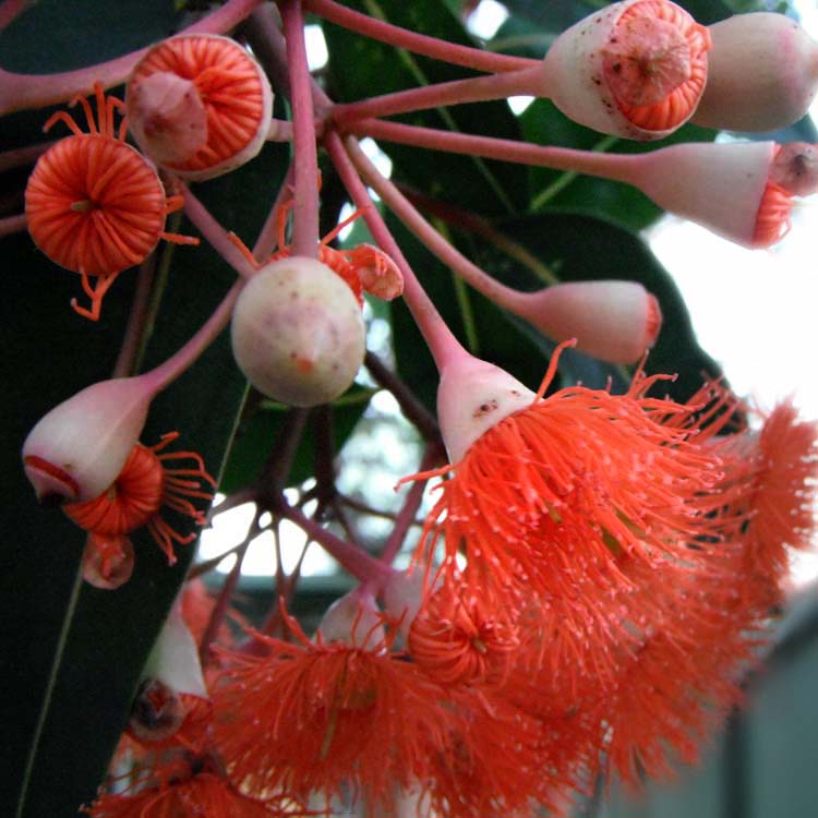
gum tree flowers
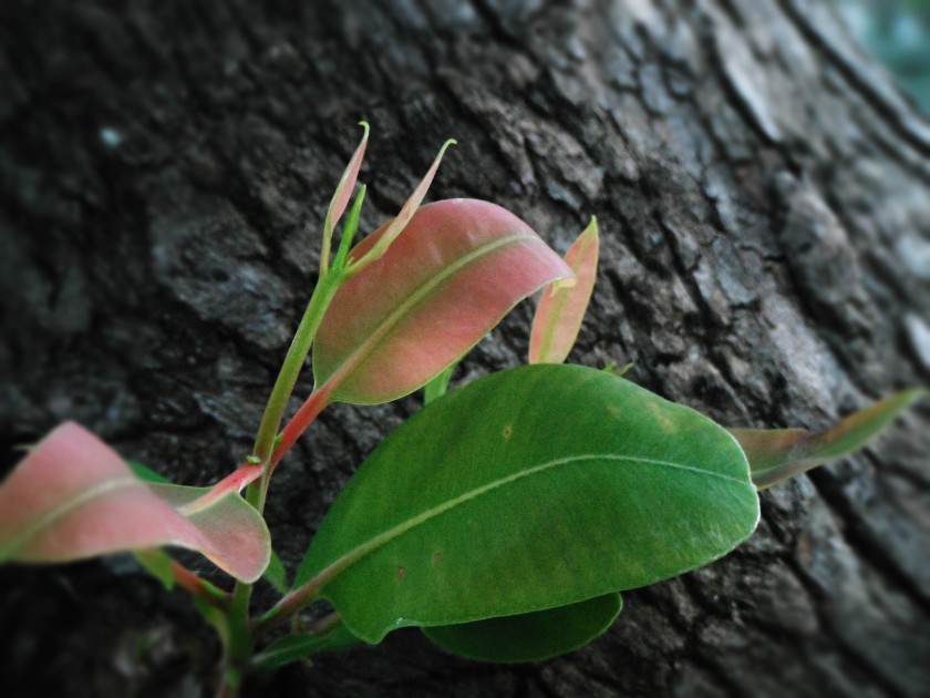
The kindergarten is named after a gigantic and absolutely gorgeous eucalypt that provides shade to their playground. I was super impressed when I visited them to discuss the site at the atmosphere of the place (friendly, happy and a bit like a family) but also that it was backed up with really clear and serious policies about sun safety, healthy food, outside playtime and behaviour management. This is the sort of project you can support one-hundred-percent. The kindergarten is non-profit, running under the same roof as the church at St Faiths Narrabeen.

I’m always intrigued as I work on projects where little details and inspiration come from. The amount of versions I have always proves a troubling factor as I try to remember whether i was working on version 1.5 or 1.6(a)… Still, its starting to take shape, which is good.

James & I also have finished and are finalising the last details and post-launch tweaking on a website for Pace Farm Eggs, which I’ll write up for you shortly. Work gets in the way of blogging, doesn’t it!